
A tour of the editor
Find your way around the template editor, from the top bar and the tool tabs to the canvas, the toolbar, the properties panel, the Layers panel and the page strip.
The editor is where you design a template. To open it, click a template on the Templates page. This page shows what each part of the editor does and where to learn more.
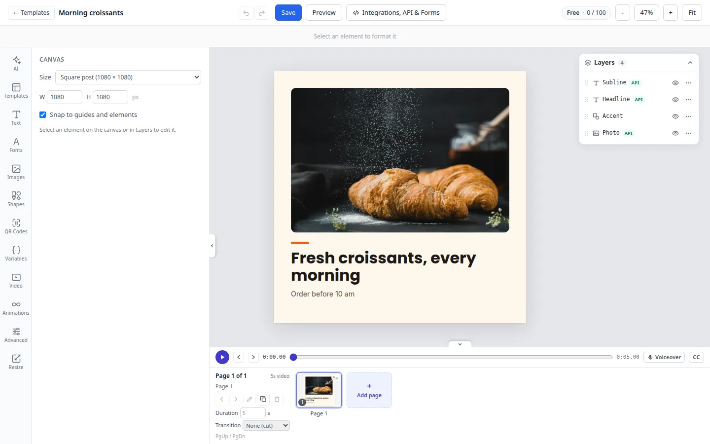
The editor has six parts:
- the top bar, with Save, Preview and the zoom;
- the toolbar under it, which changes with what you select;
- the tool tabs and their panel on the left;
- the canvas in the middle, which shows the page you’re working on;
- the Layers panel on the right;
- the page strip under the canvas.
Top bar
| Control | What it does |
|---|---|
| ← Templates | Goes back to the Templates page. |
| Template name | Click it to rename the template. |
| Undo and Redo | The two arrows. Undo your last change, or redo it. |
| Save | Saves the template. “Saved” shows when it’s done. |
| Preview | Shows the page the way a render draws it: variables show their sample values and the selection outlines go away. You can’t select or edit while you preview. Click Exit preview to go back. |
| Integrations, API & Forms | Make a test render, copy the API request, and set up a dynamic URL or a form. See Test render. On a narrow screen the button says Integrations. |
| Plan chip | Your plan and the render credits used this period. It turns red when you’ve used 90% or more. See Credits. |
| -, the percentage, + | Zoom out or in, from 10% to 400%. Click the percentage to go back to 100%. |
| Fit | Zooms so the whole page fits on screen. |
When you save, JamFrame also makes the preview image you see on the Templates page. It always shows the first page. If making it fails, you see Saved (no thumbnail): the template is saved, but the preview image wasn’t updated this time.
If you have view-only access, View only shows in place of Save. You can look at the template, but you can’t save changes.
Tool tabs
The tabs on the far left open tools in the panel next to them. Click the open tab again to hide the panel and give the canvas more room, or use the small handle on the panel’s edge.
| Tab | Use it to | Learn more |
|---|---|---|
| AI | Describe a change and let AI make it. | Design with AI |
| Templates | Put a ready-made design on this page or on the whole template. | Below |
| Text | Add headings, body text and ready-made text styles. | Text and fonts |
| Fonts | Pick a Google Font or one of your own fonts. | Text and fonts |
| Images | Upload a picture, pick one from your brand library, and set the page background. | Images, shapes and QR codes |
| Shapes | Add a rectangle, an ellipse, a triangle or a line. | Images, shapes and QR codes |
| QR Codes | Add a QR code. | Images, shapes and QR codes |
| Variables | Add variables you can type in text, such as {{name}}, with sample values. |
Dynamic fields |
| Advanced | See every setting of the selected layer. | Layout and style |
| Resize | Make other sizes of the template with Smart Resize. | Smart Resize |
Use a ready-made template
The Templates tab lists ready-made designs under Custom Presets. Filter them by shape (All, Landscape, Portrait, Square) or by category. Click one, and a dialog asks what to do with it:
| Choice | What happens |
|---|---|
| Replace this page | The page on screen gets the template’s design and its size. Your other pages stay as they are. If the template has several pages, first choose which of its pages to use. |
| Insert all N pages here | Only for templates with several pages. Adds all of them after the page on screen. A template can have at most 20 pages. |
| Replace the whole template | Every page, variable and dynamic field becomes the template’s. |
When you replace a page or insert pages, the design’s variables and dynamic fields are added to yours. If one of its keys is already used by your other pages, JamFrame renames it, and the dialog tells you how. Each choice is one step you can undo.
Canvas settings
When nothing is selected, the left panel shows the settings of the page on screen, under Canvas. In a template with several pages it says, for example, “Canvas · page 2 of 3”.
- Size: pick a size from the list, grouped by platform. It shows “Custom size” when the page doesn’t match one.
- W and H: type the width and height in pixels, from 1 to 10,000.
- Snap to guides and elements: while you drag, layers snap to the page’s edges and center and to the edges and centers of other layers. It’s on at first. Untick it to place layers freely.
Each page has its own size, so one template can hold a post and a story. Changing the size doesn’t move or scale your layers, and anything that ends up outside the page is cut off. To lay a design out again at another size, use Smart Resize.
To come back to these settings from a tool tab, click a layer on the canvas, then press Esc or click an empty part of the page.
The toolbar
The toolbar sits above the canvas. With nothing selected it says “Select an element to format it”. When you select layers, it shows the controls that fit them:
- text: font, size, weight, bold, italic, underline, color, alignment and spacing. See Text and fonts.
- images: opacity, corner radius, flip, mask, crop and effects. See Images, shapes and QR codes.
- shapes: fill, stroke color and stroke width.
- QR codes: foreground and background colors.
It always has Advanced settings and the rotation control. With two or more layers selected it shows how many (“3 selected”) and adds align buttons, and with three or more it adds distribute buttons. At the right end are Lock, Hide, Duplicate and Delete. See Layout and style.
The properties panel
Click a layer, and the left panel shows its properties. (If the Fonts, AI or Advanced tab is open, it stays open.) For one layer you see:
- Element: the layer’s Name, its ID with a Copy button, and X, Y, W and H. Text also has Auto height (grow with text).
- API parameter: whether a render can change this layer, and its key. See Dynamic fields.
- The layer’s content: Text content, Image, Rectangle or QR code.
- AI, for text and images: let AI fill the layer at render time. See AI layers.
With several layers selected, the panel says how many and points you to the toolbar. For every setting of a layer, click Advanced settings in the toolbar.
The Layers panel
The Layers card floats at the right of the canvas and lists the layers of the page on screen. The top of the list is the front of the page. Click a row to select a layer, click the eye to hide or show it, click … for more actions, and drag rows to change the order. The API badge marks a dynamic field.
Click the Layers header to fold the card away. Your browser remembers your choice. On screens narrower than 1100 pixels it starts folded. See Layout and style.
The page strip
The page strip under the canvas shows every page of the template. Click a page to work on it, and click Add page to add one. The buttons on its left move, rename, duplicate and delete the page on screen. A template can have up to 20 pages. See Pages and carousels.
What next
- Learn the shortcuts: Keyboard shortcuts.
- Choose which parts change in each render: Dynamic fields.
- Try your template: Test render.
Last updated
Still stuck?
Email [email protected] and a real person will reply. Tell us the template you were using and what you expected to happen.